Hashnode promises to provide a clear, honest platform for teaching and learning code stuff. Sounds great. I own my content? I can write markdown? And I don't have to do the devops stuff? Sounds really great. But is it accessible?
Accessibility Review (Part 1): Keyboard Test
Over time, I'll review the site's features. You get a peak at my process. As I find issues, I'll also note Hashnode's responsiveness to providing fixes or workarounds. I'll offer suggestions and try to prioritize the issues by severity, but I'm only one person doing this during "spare" time. So, I appreciate any help you provide in comments.
A Review Is Not An Audit
I'm not an auditor. My goal isn't to measure the site's compliance with accessibility standards. I want to see if the site's accessible. If you're thinking, "But Paul, AutoSponge, whatever--the accessibility standards are the best working definition of accessibility!" Then I'd say, "Good point." Which is why I'm going to use Web Content Accessibility Guidelines (WCAG) to provide insights. But some non-normative (that means not a rule, but a suggestion) documents like Web Accessibility Initiative (WAI) Authoring Practices have great suggestions for making the web accessible. Auditors don't usually get into that.
First Impressions
Keyboard Review
Perceivable
Your computer should include the essential Assistive Technology (AT) for testing keyboard accessibility--the Tab key. Try it yourself, go to the Hashnode splash page (use the private/incognito window if you're logged in) and start tabbing.
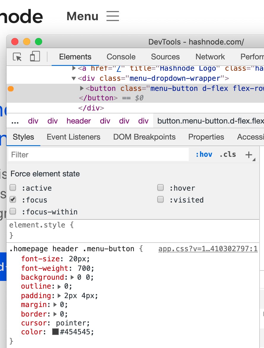
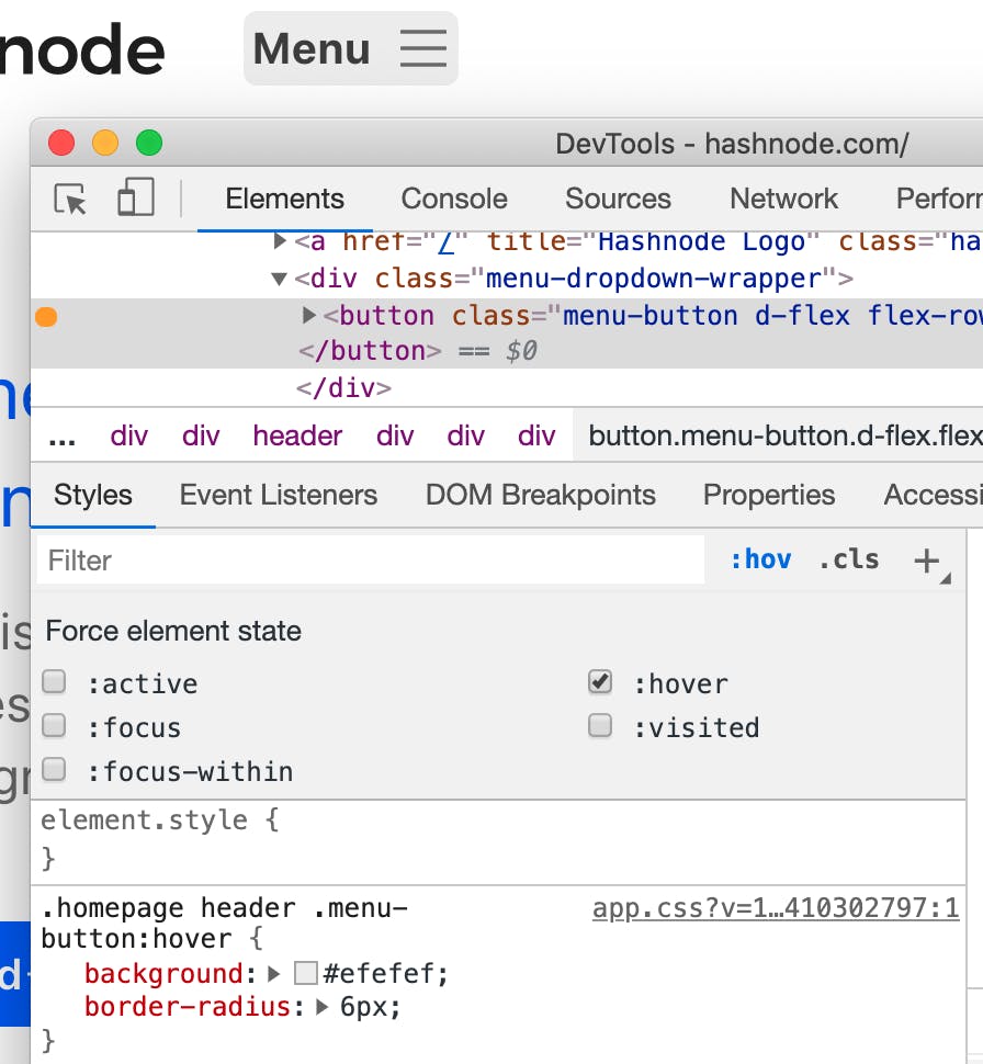
What did you notice? I noticed that the second tab stop, "Menu" (seems important), has no focus indication. But it has a hover state? Rude. Even if it doesn't satisfy Focus Visible, it shouldn't be difficult to use the same :hover styles on :focus.


Something like Focus Visible could be the fault of a developer not applying styles provided in the wireframes. Or, it could have been the designer that didn't provide that guidance. But, I put the fault back on the developer for not asking "what happens when I tab to this?"
Operable
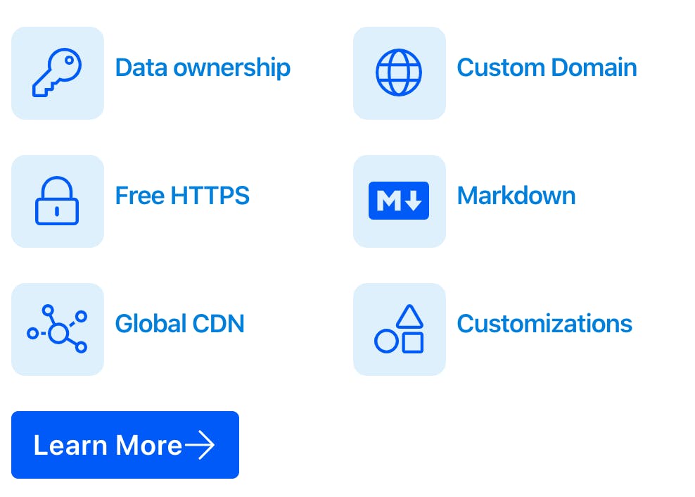
I checked if all the interactive elements were in the focus order. This requires some clicking on things that look like buttons or links to see if they really are (like the items above "Learn More").

Then I check that I can operate interactive elements with the keyboard using space, enter, escape, and the arrow keys as appropriate. Pay attention here to how space and enter work differently on buttons. space fires the event on keyup while enter fires on keydown. Hashnode's handler code gets this right.
In this case, the "Menu" works with space and enter as expected but it opens a non-modal dialog and escape doesn't close it. Not ideal, but not a show-stopper.
The "Search" widget offers a similar experience when the suggestions flyout after typing. In this case, you can't type something and hit enter to get a page of search results. You can only pick results from the flyout. Imagine (or try), searching for something, tabbing through the list to not find what you want, then have to shift+tab back through the entire list just to close the results. Not ideal, but not a show-stopper.
Understandable
I'm looking for tab stops that don't make sense or are out of order. There seems to be a repeating pattern in the "cards" where multiple links point to the same thing. This means that every card is three tab stops instead of one. I can already guess that this will be a problem for screenreaders when I get to that part of the test (makes note).
Robust
Remember the "Search" widget? It's a single-point-of-failure (SPOF) for that feature. You can't reach Search by other means. So, if JavaScript fails or the search result you expect isn't listed, Search is "broken" for you.
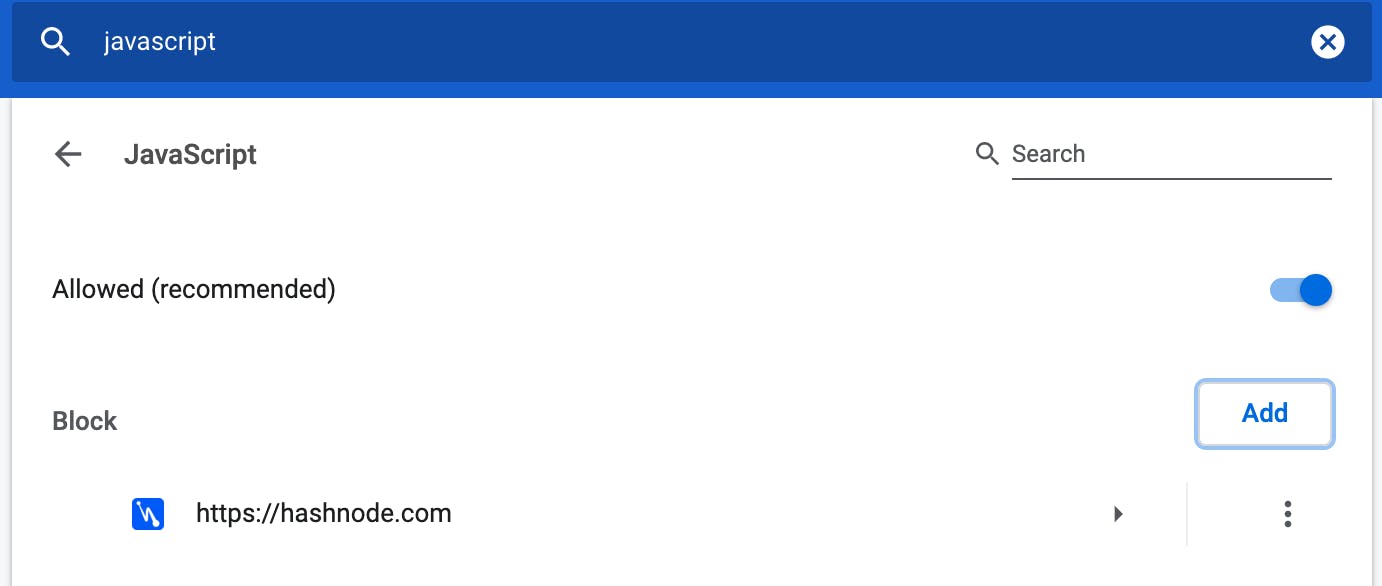
To make sure I didn't miss some clever Progressive Enhancement, I shut off JavaScript and reloaded the page to try search as if it were a form field (how Google works). To disable JavaScript selectively, open Chrome settings and find "JavaScript." Then, add the url you're testing to the "block" list. When you're done, click the appropriate "kebab" menu and then choose "Remove."

Incidentally, the homepage "Menu" also does nothing without JavaScript, so that's an opportunity. It could start as a link that points to a navigation page, then "upgrade" when JavaScript is available.
Reporting Accessibility Issues
Every app needs an accessible way for users to report issues related to disability or assistive technology (AT). Sites with an accessibility policy usually link to either an accessible HTML form or an "access[at]<company>" email address. By digging into Hashnode's github organization, I found a link to the user feedback repository. So, for the time-being, I'll post my findings there. I'll always check for a duplicate issue before filing a new one.
Not Every Accessibility Issue Is The Dev's Fault
Design choices can cause accessibility issues. They're more rare and often the developers can just override the design with a better one--what's the designer going to do, log into github and change it back? [insert evil laugh]
Content authors also share blame. I'll point out those authoring pitfalls and suggest features Hashnode can include to reduce those problems. Since it's a federated content model, content issues will probably persist. I hope to reduce or mitigate them.
Ytho
I want to use this tool. But only if it's accessible. That includes the authoring experience. Inaccessible development and authoring tools act as gatekeepers. Filtering the voices of people no one considered while designing, developing, or testing the tool.
Because this post is already at 4-5 minutes reading, I'll continue this as a series of posts.

