Last time, I covered a quick keyboard review. I avoided some important bits like accessible name and role which come little later, when I review content.
I'm impressed Hashnode responded positively to my review. Over the past few years, I grew weary of advocating for accessibility against product owners and project maintainers immune to my "charms."
Accessibility Review (Part 2): Typography and Color
In the keyboard test, I discussed the menu and search patterns. I plan to dive deep on components, but I need to address some foundational elements first.
First Impressions Continued
Legibility
Readability differs from Legibility. Before we can understand what we're reading, we (sighted folks) have to see it.
Typography
If you look in the code, Hashnode was built on Bootstrap. The "native" font stack takes advantage of all the research that went into the OS. I find it difficult to do better without really understand typography (hint: I don't).
The WCAG Success Criteria for "resize text" says we need to be able to double the text size and not loose any information. This is another quick test in Chrome, "View > Zoom In" or use the quick keys until the magnification is 200%.
Reflow
I check reflow next because I use the same tool, browser zoom, to see if I can go to 400% and not get weird scrollbars. You'll notice that some components like "My Feed" and "Who to follow" have horizontal scroll bars, but the content remains readable and doesn't require scrolling in two directions.
Color Contrast
Chrome has a built-in color contrast tool, but it often suffers from the same limitations of automated accessibility scanners--they try to programmatically determine the background and foreground colors from the CSS.
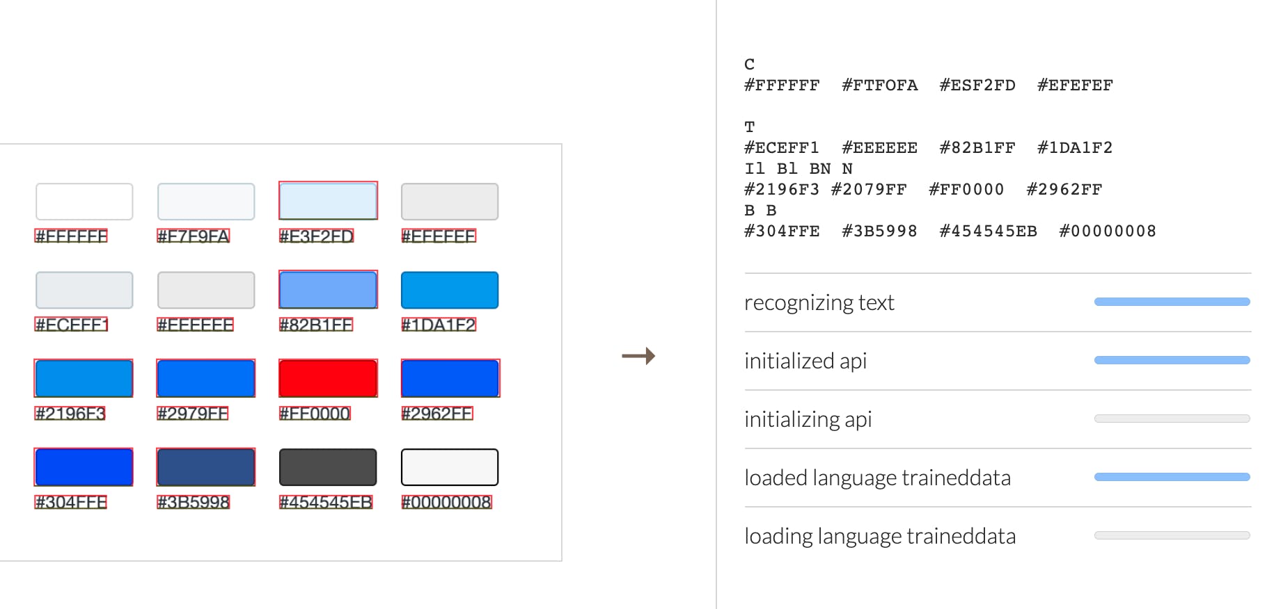
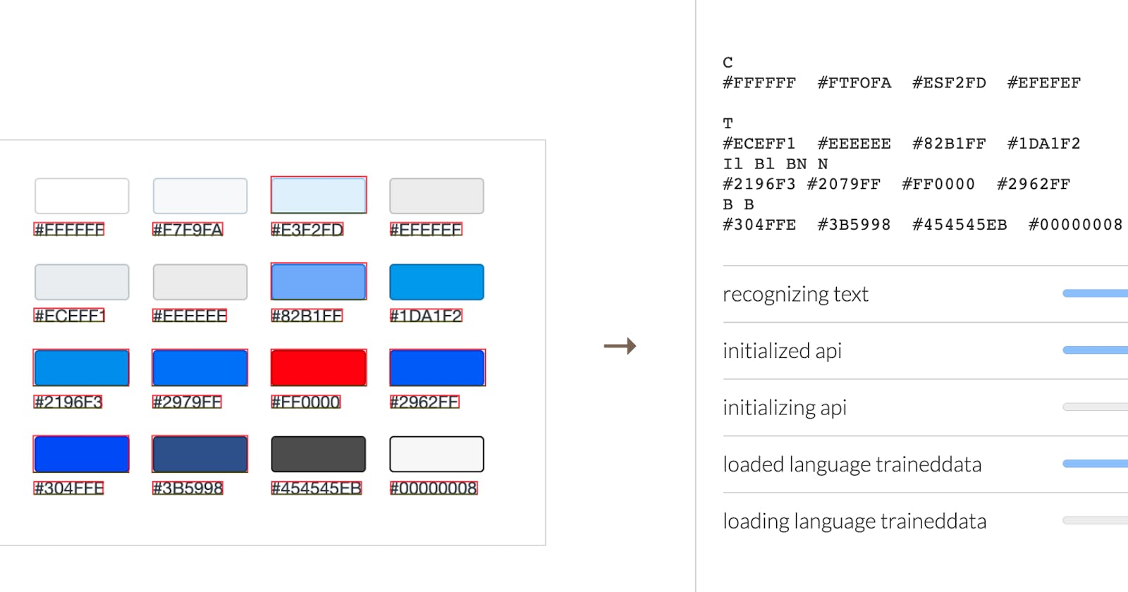
Knowing this, I like to setup a reference palette before I start. This is a little easier to see now with Chrome's experimental CSS Overview panel. You may need to restart devtools or reload the tab. Once you have CSS Overview enabled, go to the new devtools panel tab and click "Capture Overview". Sadly, you can't copy/paste the content here. So, I take a screenshot of just the colors and drop them into the Tesseract.js demo page.

Next, I copy the OCR output and paste it into ColorCube or the Eight Shapes Contrast Grid, cleaning up any stray characters and separating each hex code by a line break. Now I have a way to quickly validate anything the automated scan misses.
When it's a small page or there's very few colors, I'll just eyeball the palette. But for Hashnode, I loaded the axe extension, scanned the page, and made sure I was set to "Needs Review". Ignoring the other issues for now, I focused on the color contrast issues. Unlike the color contrast issues under "Violations", axe can't pick up one or more of the colors.

Overlapping elements, gradients, and alpha transparency cause automated checks to either guess or throw up their hands. For this histogram, the text is a partially transparent black, rgba(0,0,0,.66). That creates two different colors depending on whether it's over the grey (#eceff1) or the blue (#82b1ff). The tools for this type of check suck. Color picker tools get skewed by the display so we need to calculate the new color. There are a few online tools that do this but I like rgba-to-rgb-conversion because it shows you the math in JavaScript. This passes the required 4.5:1 color contrast ratio. Darker background colors would not pass.
For the other color issues, axe provides a good summary, so I'll paste that into the issues. If you follow the "Learn More" link in axe, you can also see the fix advice, "Large text has been defined in the requirements as 18pt (24 CSS pixels) or 14pt bold (19 CSS pixels)". By following this advice, we can mock up what the fix would look like for comparison. See the individual issues for my fix recommendations.
In addition to Chrome devtools, I used the Webaim contrast checker to "slide" my colors into compliance. To check how links need to contrast with surrounding body copy, check out the Webaim link contrast checker.
- Color Contrast: Featured Label #169
- Color Contrast: Feed Tag #170
- Color Contrast: Discussion Label #171
- Color Contrast: Follow Button #172
- Color Contrast: Poll Footer #173
- Color Contrast: Tweet #174
Ytho
I was drawn to Hashnode for the simplicity. The minimalist design reflects that well. Improving legibility with color contrast, typography, and whitespace will help everyone read this content on a wide variety of devices with or without assistive technology (AT).

