


Accessibility Review (Part 4): Screen Reader and Markup
This post continues the accessibility review for the main page. You can get a nice write up of how to do this sort of review from Web Accessibility Initiative (WAI) Easy Checks.
I generally save the screen reader test for last. I'm not very fast and I often have to change browsers. I work on a Mac and using Safari with VoiceOver (VO) is recommended. LevelAccess has a nice table of AT combinations and support.
I can't really show you how I test with the screen reader without doing a whole video. Which only helps if you use VO on a Mac. Deque has the screen reader survival guide with basic keyboard shortcuts you'll need for most screen readers.
Context is Everything
Anything meant to convey information must have an accessible name. Interactive components, like buttons and links, must have an accessible name as well as a role to explain how the component operates. Just having a link marked up as a link and having a name for that link isn't enough for accessibility. Because assistive technology (AT) users may jump around the page or get lost, everything needs to be put into context. Often clarity trumps brevity.
For instance, on Hashnode's main page you see "cards" with feature content. It may be under "Developer Stories" heading if you did not log in or under "Recommended for You". These cards have many links in them when it should probably be one or two. At least three links all point to the same location, the post. The author should be a link, but not two. The comments counter should be a link only if it navigates directly to comments and not just another post link.
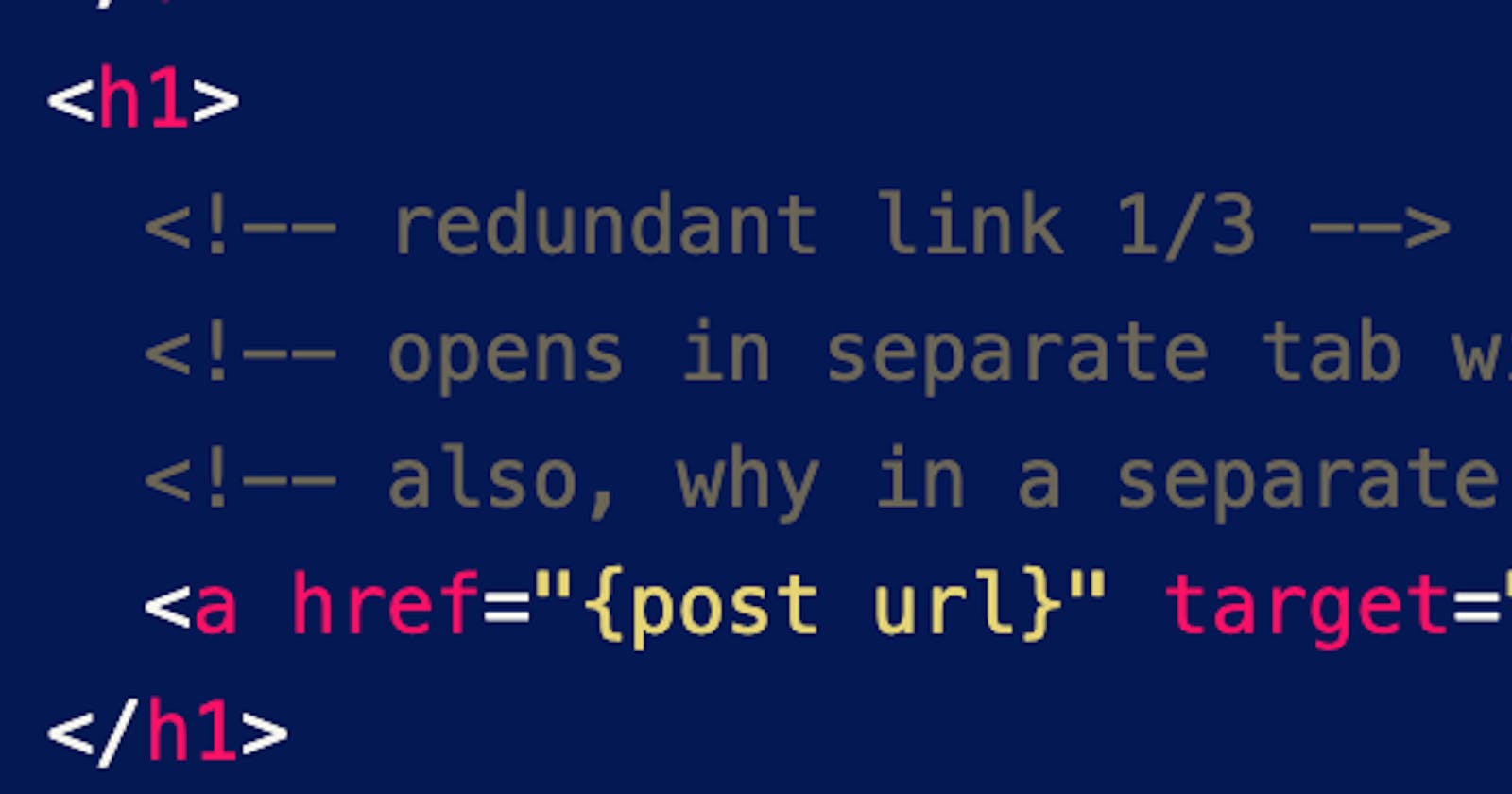
Let's look at the card example. I put my comments inline and removed the "noise" attributes.
<div>
  <!-- post href 1/4 -->
  <!-- no accessible name -->
  <a href="{post url}"></a>
  <div>
    <div>
      <div>
        <!-- accessible name describes the photo not the link destination -->
        <a href="{author search result}">
          <img alt="{author}'s photo" src="...">
        </a>
      </div>
      <div>
        <!-- redundant link? -->
        <a href="{author devblog}">{author}</a>
      </div>
    </div>
    <h1>
      <!-- redundant link 1/3 -->
      <!-- opens in separate tab without notification -->
      <!-- also, why in a separate tab? -->
      <a href="{post url}" target="_blank">{post title}</a>
    </h1>
    <p>
      <!-- redundant link 2/3 -->
      <!-- opens in separate tab without notification -->
      <!-- accessible name is a huge long mess -->
      <!-- should be plain content or maybe linked by aria-describedby (requires user testing) -->
      <a href="{post url}" target="_blank">
        {truncated post content}
        ...
      </a>
    </p>
  </div>
  <div>
    <div>
      <!-- redundant link 3/3 -->
      <!-- opens in separate tab without notification -->
      <!-- accessible name hides number of likes -->
      <!-- should be "{post title} has {likes count} likes. -->
      <!-- if "Total number..." was off-screen text, it would still expose the number"
      <a href="{post url}" target="_blank" aria-label="Total number of likes">
        <svg></svg>
        <span>{likes count}</span>
      </a>
      <span>·</span>
      <div>
        <!-- accessible name provides no post context -->
        <!-- should be "Bookmark {post title}." -->
        <button aria-label="Bookmark this post">
          <svg></svg>
        </button>
      </div>
    </div>
  </div>
</div>
To clean up the redundant links and make things like VO's Links rotor menu more of a pleasure, we need a "block link". Adrian Roselli's article Block Links, Cards, Clickable Regions, etc. covers this topic well.
Ytho
Links need to describe where they will take you on click. Buttons need to describe what will happen when you click. If AT gives you a list of links and they all say "More" you have no idea which one to click. In general, off-screen text works better than aria-label. Component widgets with static defaults in the accessible name calculation should raise red flags to developers.